04
UX Design, UI Design, Prototyping, User Testing
Virgin Money
Background
I was hired as a Senior Freelance Product Designer to work with Virgin Money and 10x Banking to design a brand new onboarding experience for a brand new challenger bank. Virgin Money wanted to be one of the first of the traditional banks to develop their own mobile based bank with the cutting edge technology.

The Challenge
Prior to working on this project I had never worked on a banking project, which I believe became an asset, as I was able to solve complex fintech issues with fresh eyes. The main issue was that the current onboarding experience was long and arduous.


The Approach
As a UX Designer my approach was to breakdown the amount of steps and to spot opportunities to simplify the process and also to introduce a bit of surprise and delight.
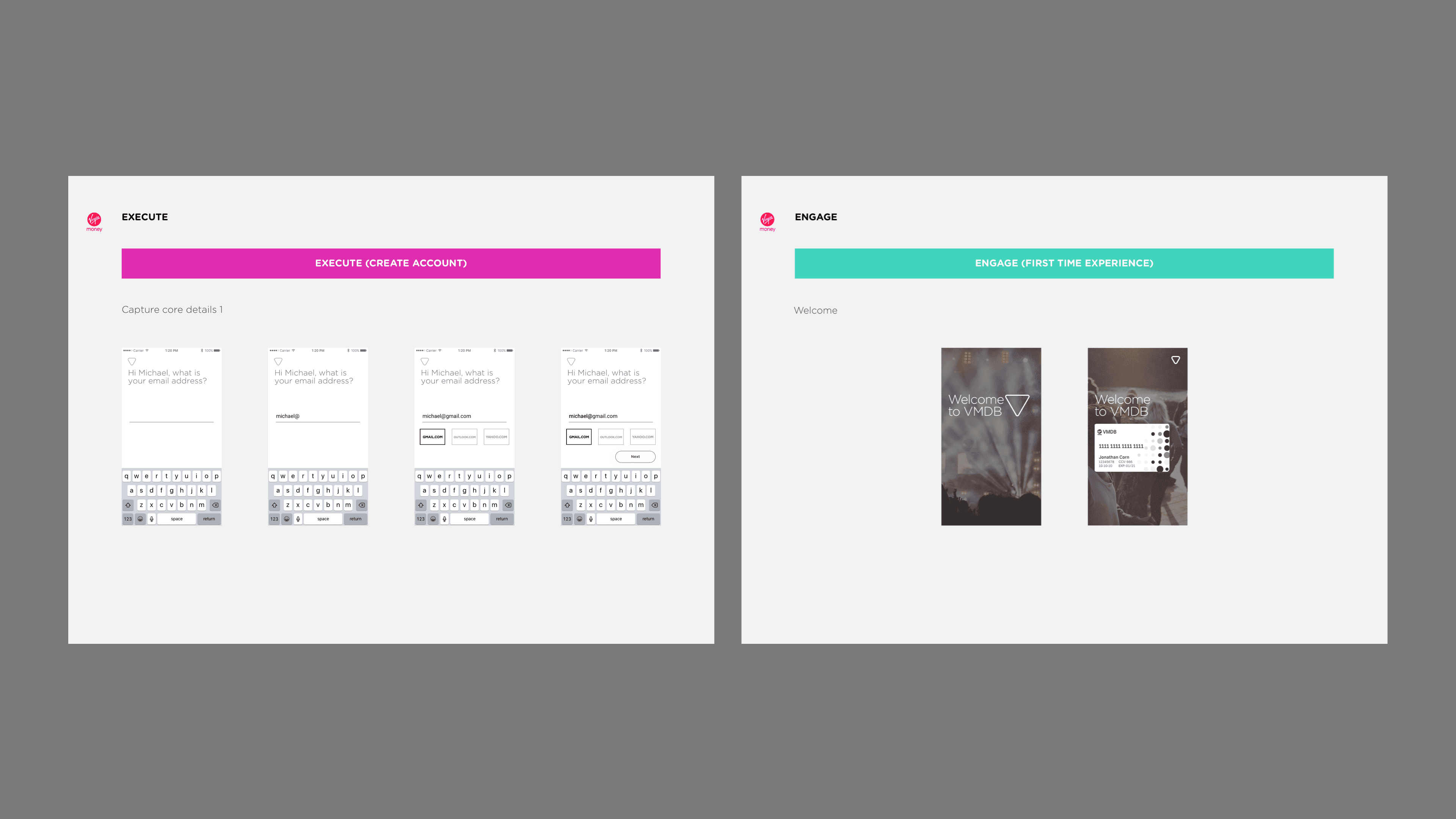
A banking application is simply a long form, so I designed the screens that would be as frictionless as possible I worked on the onboarding experience with the best team of business analysts to solve complex problems from the one time passcode to logging via another device with a QR code


The Opportunity
Banking can be perceived as boring, so it was important to subvert the idea of traditional banking. I believe the best experiences are the most enjoyable and memorable, so we worked hard to make the experience fun. Introducing joy, surprise and delight is essential when you’re trying to onboard a customer to a mobile bank quickly.
We conducted rigorous user testing and used enticing illustrations and captivating copy to engage prospective users. Joy is essential if you want to build engagement. This project showed me that introducing flourishes of fun and personality can really enhance the experience..


Mapping out the journey


The Result
We shipped and iterated after two rounds of testing with prototypes.
Sales up by 13% from the homepage
We unlocked a new way of increasing revenue and engagement
We realised the power of having a cross functional team
95 % of user stated that they wanted more features like this
Next work
