05
UX Design, UI Design, Prototyping, Design Systems
Addison Lee
Background
Addison Lee are a London-based private hire taxi and courier company, primarily known for providing premium car services in the UK. Founded in 1975 by John Griffin, the company has grown to become one of the largest and most recognised private hire services in London, serving both individuals and businesses.
The Brief
To remain competitive in the evolving transportation market and to better meet the needs of Addison Lee's customers, it is essential to refresh the Addison Lee app. As a key touchpoint for our users, the app serves as the primary platform for booking rides, managing accounts, and accessing services. However, user feedback and market analysis indicate the current app is outdated in terms of design, functionality, and overall user experience.
While the Addison Lee app has successfully served our customers, it is facing increasing pressure from competitors like Uber, Bolt, and others who have invested in sleek, user-friendly applications. Current issues with the app include:
• Outdated User Interface: The app design feels dated compared to modern apps, making it less appealing to new and existing users.
• Limited Features: Key functionalities such as real-time ride tracking, personalized recommendations, and advanced booking features are missing or poorly integrated.
• Performance Issues: Customers report slow loading times, bugs, and occasional crashes, leading to frustration and abandoned bookings.
• Complex User Flow: Navigation is not as intuitive as it could be, resulting in a clunky experience that increases user drop-off.
• Lack of Personalistion: The app does not sufficiently leverage user data to offer tailored recommendations or promotional offers, which could enhance user loyalty and increase engagement.
The Approach
The project was structured into three main phases:
1. Discovery Phase
2. UX Design Phase
3. UI Design Phase
Each phase was time-boxed to two weeks. The project was 6 weeks in total
During the Discovery Phase, we focused on uncovering existing requirements, revisiting and expanding the app review, gathering insights from competitor apps, and defining design principles to guide the UI. Additionally, we established collaboration processes with the development team.
Following this, we transitioned into the UX and UI Design Phases, where I worked on both UX and UI for Android and iOS platforms. Weekly meetings with the Managing Director were scheduled in advance to review and approve UX designs before progressing to the UI phase. I also participated in weekly Scrum stand-ups to share UI updates and align with the development team.
Improvements
After an intense discovery period we gathered these main insights
• Core User Journey: There are valuable lessons and improvements to be gained from analysing other apps
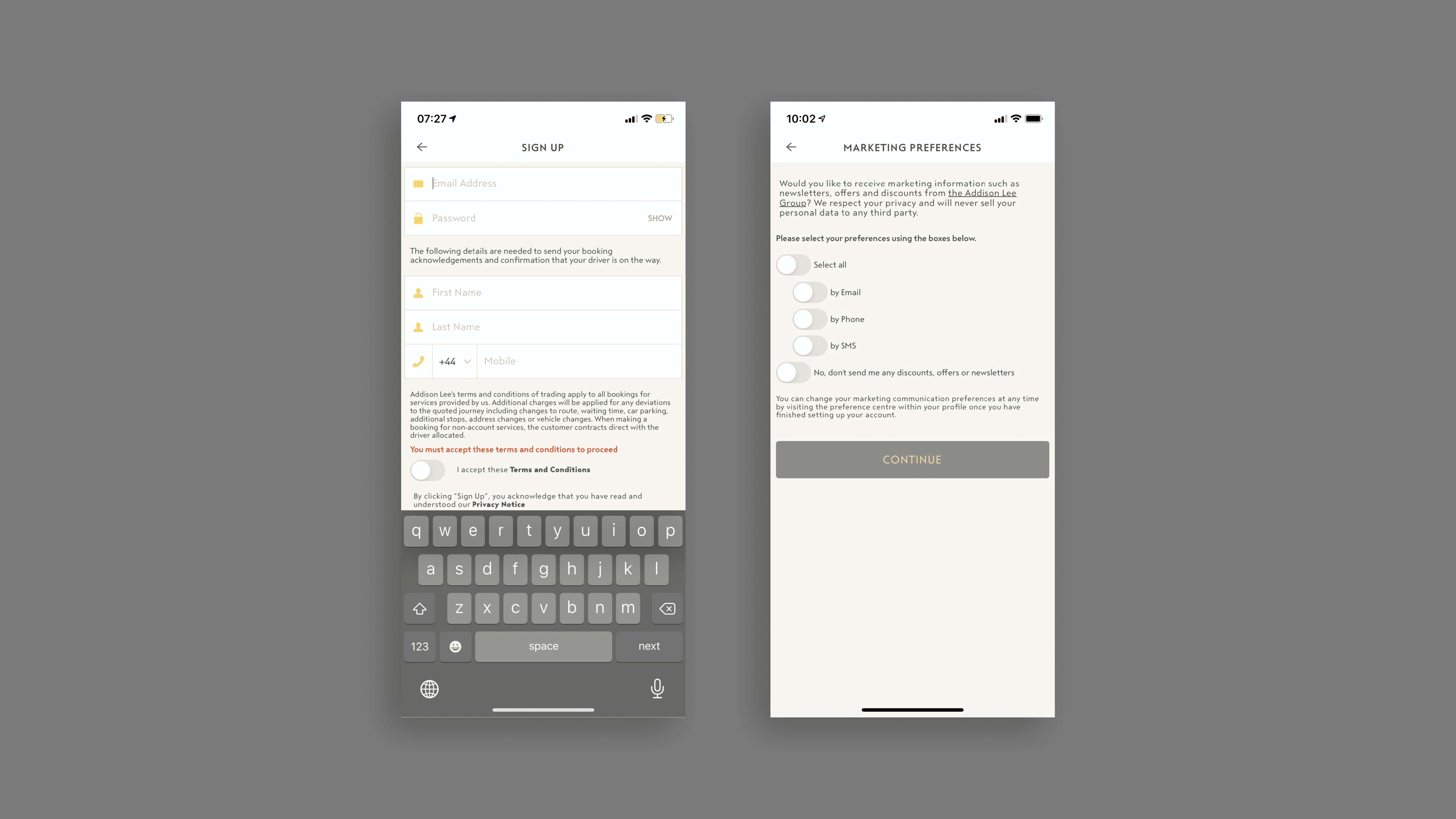
• Onboarding: Simplify the process by breaking it down into clear steps, consolidating all T&Cs and legal agreements into a single, easy “accept all” screen.
• Route Setting: Several apps provide strong examples of how to effectively manage route selection.
• Service Level Selection & Price Clarity: Some apps demonstrate excellent ways to display service options and clarify pricing.
• Payment Integration: Payment should be seamlessly integrated, utilising both native payment systems (such as Apple Pay) and traditional card options.
Main Recommendation:
Simplify the onboarding process, streamline route selection and pricing/service steps, and ensure seamless in-app payment integration
The Outcome
The new design and concepts provided Addison Lee with a clear north star to guide its future direction. This proof of concept set the foundation for upcoming product designs, marking a fresh beginning for the company. With this new approach, Addison Lee is now positioned to compete more effectively with disruptive innovators entering the sector.


