01
UX Design, UI Design, Concept Development
Aesop
Background
Aesop is an Australian luxury skin care brand. Aesop's objective has always been to formulate skin, body and hair care products of the finest quality, as well as fragrance and accessories for the self and home. Each Aesop store has a unique interior design developed in collaboration with various architects, interior designers and artists.
Overview
Aesop’s have a content platform called The Athenaeum, The Athenaeum is an online space created by the luxury skincare brand to explore and share various cultural, intellectual, and artistic content. This platform is an extension of the brand’s commitment to blending skincare with a deeper appreciation of culture, literature, and the arts
The Challenge
The Athenaeum launched in February 2021 as a minimum viable product on the main Aesop website. The Athenaeum category that houses content that can be broadly classified into product, culture and literature.
In its current state, the design of the Athenaeum is structured in a chronological order that pushes old articles down when a new article goes live on the site. There are no categories or filters within this page that allow or help a user to navigate to an article of their interest. This has the effect of making the page an infinite ‘scroll’ that requires infinite scrolling.
In a bid to help users find content I was tasked with to redesign The Athenaeum into four content pillars: Product, Literature & Culture, Wellbeing, and Stores & Architecture. Each pillar will house content that is based on the yearly content calendar created by the Digital Team. Of these, the Product-focussed pillar is the most important for SEO. This pillar aims to drive quality organic traffic to The Athenaeum, increase organic search rankings for generic keywords that are relevant to Aesop and so improve its share of voice, increase brand awareness and search visibility of Aesop.com and increase the authority of Aesop as a destination for skin care.
The Approach
We established as a stakeholder group the key business goals for the website.
Increased organic traffic to The Athenaeum
Increase unique users and returning users
Decreased exit rates of users
Increased article shares
Increased time on each page
Increased interactions with content
Increased sales in products
User Testing
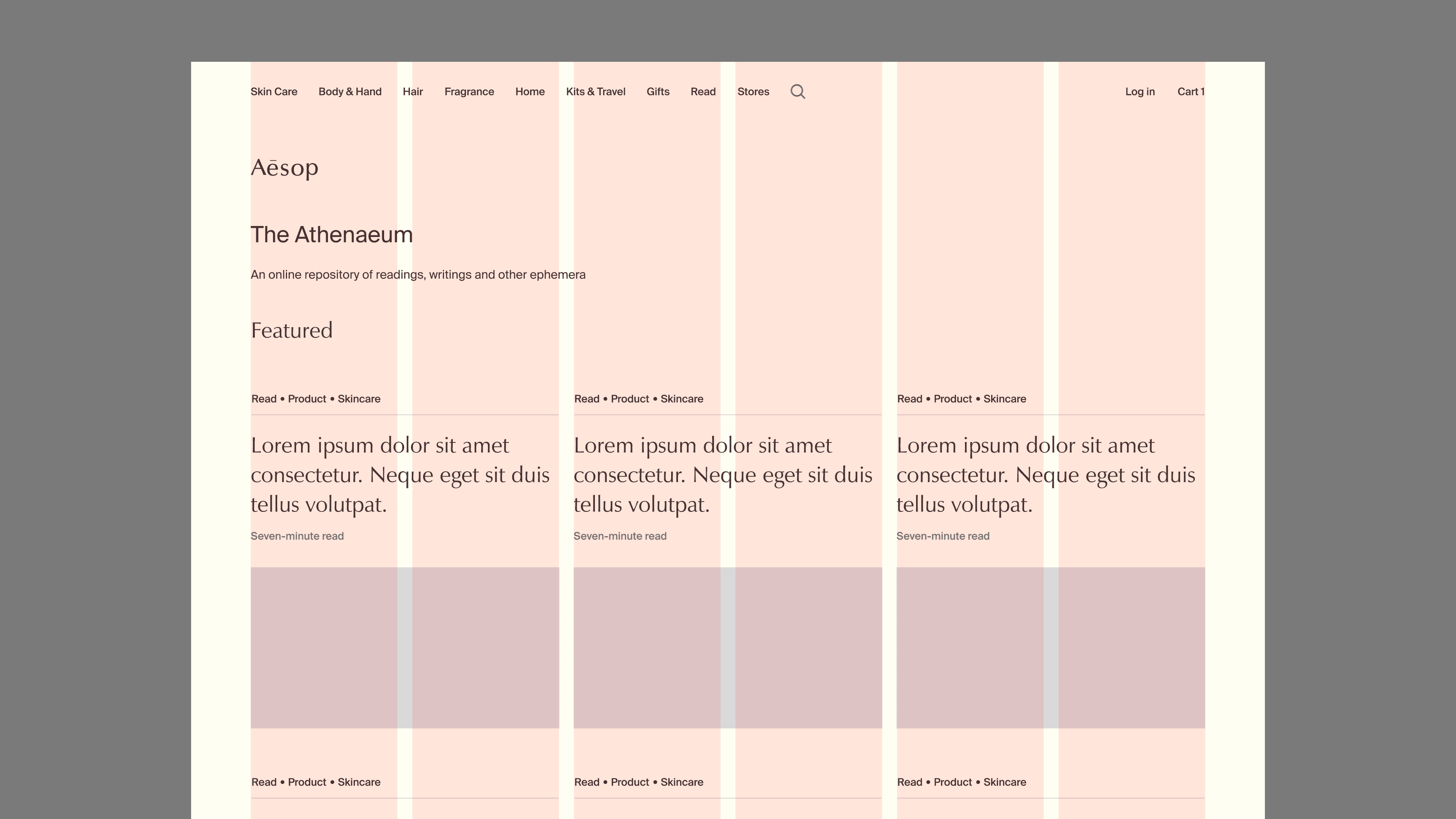
I experimented with different grid layouts to expose as much content to the user as possible, knowing this would highlight the variety of content we offered. Displaying more content on the homepage set the expectation that the page was designed for browsing. This approach not only enhanced the user experience but also supported the project’s search engine optimisation goals, aligning with the business objectives.
Exploration
I experimented with different grid layouts to expose as much content to the user as possible, knowing this would highlight the variety of content we offered. Displaying more content on the homepage set the expectation that the page was designed for browsing. This approach not only enhanced the user experience but also supported the project’s search engine optimisation goals, aligning with the business objectives
The Result
After several iterations of prototyping and ongoing testing against the business objectives, a solution was designed that met the project’s goals. This included optimising the landing pages for search engines, organising content to ensure users could easily find what they needed, and setting up the pages to enable Aesop’s products to be sold effectively from the new website.


