
I design experiences that make people’s lives simple.
PRODUCT DISCOVERY AND USER RESEARCH
RAPID PROTOTYPING
DESIGN

PRODUCT DISCOVERY AND USER RESEARCH
RAPID PROTOTYPING

DESIGN
Virgin Money
The future of banking
I was hired as a Senior Freelance Product Designer to work with Virgin Money and 10x Banking to design a brand new onboarding experience for a brand new challenger bank. Virgin Money wanted to be one of the first of the traditional banks to develop their own mobile based bank with the cutting edge technology.

Prior to working on this project I had never worked on a banking project, which I believe became an asset, as I was able to solve complex fintech issues with fresh eyes. The main issue was that the current onboarding experience was long and arduous.

As a UX Designer my approach was to breakdown the amount of steps and to spot opportunities to simplify the process and also to introduce a bit of surprise and delight.
A banking application is simply a long form, so I designed the screens that would be as frictionless as possible I worked on the onboarding experience with the best team of business analysts to solve complex problems from the one time passcode to logging via another device with a QR code. This project is by far my proudest. All in all you can sign up for a brand new account in under 8 mins, which isn’t bad considering it used to take a few days.

Banking can be perceived as boring, so it was important to subvert the idea of traditional banking. I believe the best experiences are the most enjoyable and memorable, so we worked hard to make the experience fun. Introducing joy, surprise and delight is essential when you’re trying to onboard a customer to a mobile bank quickly.
We conducted rigorous user testing and used enticing illustrations and captivating copy to engage prospective users. Joy is essential if you want to build engagement. This project showed me that introducing flourishes of fun and personality can really enhance the experience.


Absolute Radio
UK’S FIRST RADIO APP ON APPLE TV
At Bauer, my design partner and I were tasked by the Product Manager to create a proof of concept for Apple TV for Absolute Radio.
The aim was to design a minimum viable product that would increase the awareness of Absolute Radio as well as give the station a presence on a brand new digital platform. The real challenge was to complete the project end to end in 3 days. Could it be done? Challenge accepted.

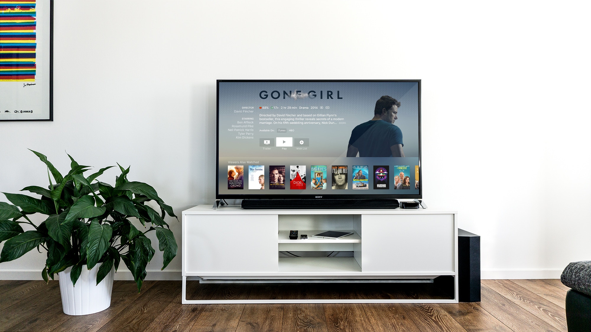
Visual Design by Shatteredpanda
YouTube for Artists
Empowering artists to build their careers.
YouTube for Artists is a brand new analytics platform for musicians. YouTube’s Music Insights tool lets artists find out where their fans are so they can plan their next tour around them. The tool allows artists to grow their audience and build their own career without the need for a record label.
To provide artists with accurate analytics that will empower them to engage with their fans.
For users to be able search a location and understand the top ranking artists in the area.
For users to be able to search by artist and understand their top ranking audience numbers across the globe.


Paper prototypes

For this project I worked with an excellent team of designers at an agency called Rehabstudio. I was hired for a month and it was intense but a fantastic experience.
My process was to start sketching and gradually increase the detail after each user test. The process was extremely lean and it was very productive way of working. We produced what felt like 1000 paper prototypes. It felt arduous but it also gave us the ability to feel quickly and validate our assumptions. We only started to produce hi fidelity prototypes when we felt confident we were heading in the right direction, which saved us a lot of time.
YouTube for Artists is a massive success and is continuing to do well. Have a play with the tool and see for yourself. YouTube for Artists

Mike Barwis
Re-imaginng fitness for the 21st Century.
Mike Barwis is the founder and CEO of Barwis Methods; he is a Certified Strength and Conditioning Specialist. He currently serves as a Senior Advisor to the New York Mets, he’s also the star of the Discovery Channel's TV show "American Muscle”, which features his work with professional athletes and people with disabilities.
I designed an innovative fitness app for high performance app for Barwis Methods with my design partner Matt Sewell.
This project needed a core understanding of the way the founder Mike Barwis worked with athletes and how is clients would interact with the product I was designing. To get a true understanding of how I should design this product I flew out to his gym in Detroit to conduct user research.


Visual Design by Shatteredpanda

Visual Design by Shatteredpanda
Work London
Inspiring professionals to work and network in interesting places.
Work London is a hyperlocal discovery app that helps professionals find the most inspiring places to work around London. The places can range from the trendiest coffee shops to museums to open green spaces within the city. Once the user gets to their desired location they can connect to like minded professionals and collaborate on projects.
The goal was to create a companion app that would help professionals get out of the office and find inspirational places around the city.
The goals were very simple.
Inspire professionals to get out of the office.
Connect to like minded professionals that are also hot desking to inspire collaboration.
Get professionals excited about working again.
From day one, it was obvious that this product was going to be a mobile phone application.
The challenge was to create a fantastic discovery experience that was supported by geo location positioning that would assist the user. This app was going to be primarily a companion app.
To really capture the opportunities and pitfalls of working, I observed nomadic workers in London.
Some of the most interesting insights came for watching the buzz around Google Campus in London. I conducted a few user interviews and captured the main pain points. The major things I discovered was that people wanted to find the wifi code when they arrived at their location. They also wanted to know the opening times of the places, there was no point in being inspired, travelling to a location only to discover the place was closed. From this point onwards we made an executive decision to include as much useful information regarding the location as possible.

Visual Design by Shatteredpanda
Work London has since been rebranded to Work Wherever.
Work Wherever has been launched in app store and has been a run away success. Forever Beta have announced that the app has become so popular that they are looking to build an Apple Watch version of app.

Visual Design by Shatteredpanda
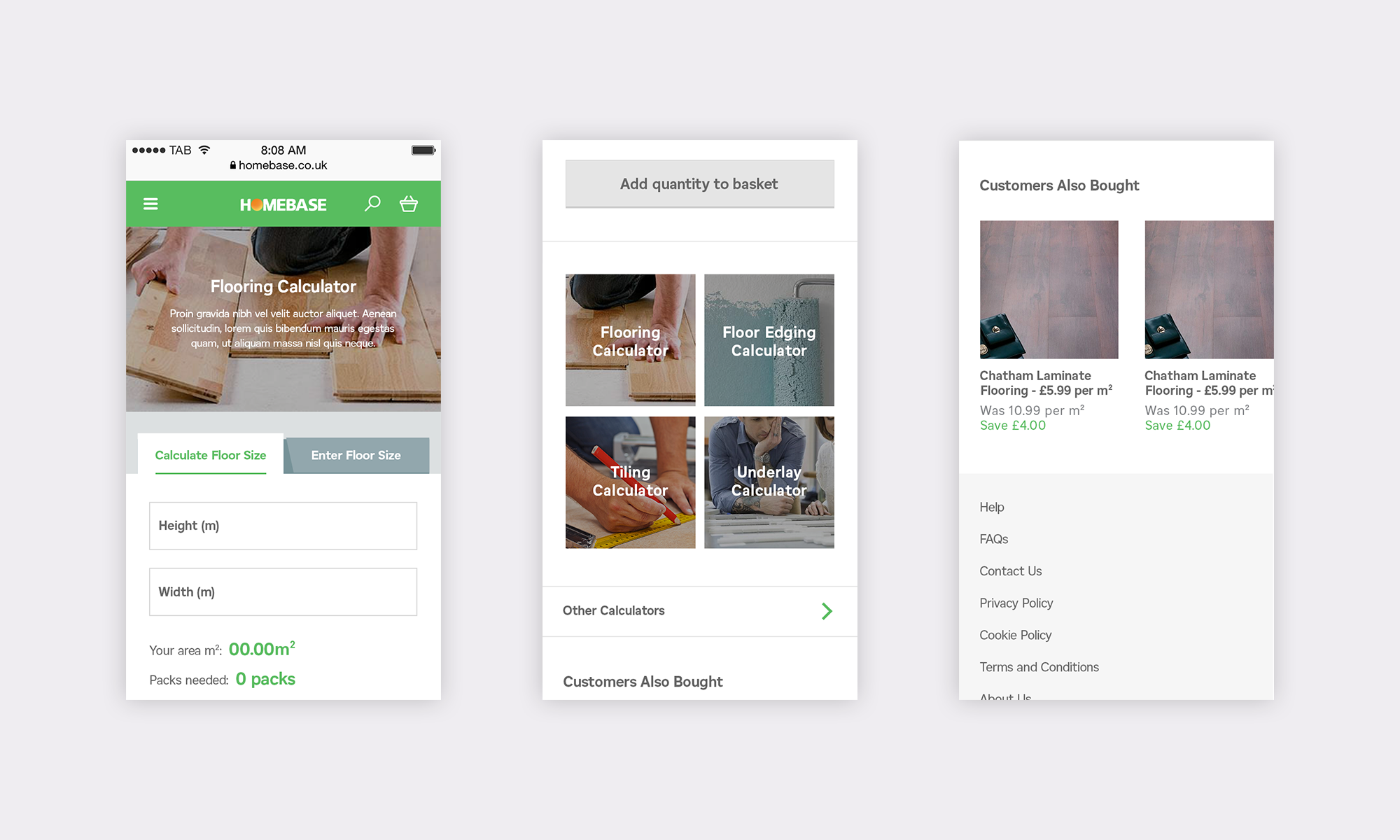
Homebase
Simplifying DIY
Homebase wanted to get at an understanding of the attitudes and behaviours of their customers towards tackling DIY projects. The strategy behind gaining these insights is that Homebase could start building tools that would enable customers to plan their projects and purchase goods on their website.

It’s really important to understand the user by conducting user interviews . It’s helps me build empathy with their pain points when design solutions. Designing with empathy is almost a super power when it comes to crafting products that user’s genuinely love. Being user centric is good but as a Product Designer, it is equally important to have a core understanding of the business requirements. Essentially all online retailers want to concentrate on selling stuff online. So I’m often asked to make the e-commerce journey as slick as possible with minimum friction.
As a team of designers on this project , we helped Homebase stakeholders focus on outcomes rather than solutions, this enabled us to look at the experience of a user planning their DIY project holistically.
After conducting numerous user interviews I was in a great position to see some recurring themes. The best way to displays these themes was to put together user personas. User personas clearly illustrate the needs and behaviours of the user quickly, so it’s a valuable artefact that can help project stakeholders understand build empathy with their customers.


I quickly identified that DIY projects are daunting prospects to Homebase customers. The idea of planning a project seemed time consuming. We spoke to users who had recently completed their own DIY projects.
The key pain points were as follows.
There was no time to do the actual DIY work.
There was insecurity about not knowing what they were doing.
They uncovered unexpected problems on the project that would cost them time and money.
They underestimated the length of time of the project.
They miscalculated the quantity of the materials needed to complete the project.

After gathering insights, we identified that users had no way of calculating their materials when planning or even purchasing products. We holistically gathered a lot of insights. however it mades sense to update the website with a suite of planners and calculators that would would immediately enhance the user experience as well as boost sales. We started designing rapid prototypes with users, constantly testing and refining our ideas.
Along with my design partner Matt Sewell, we designed a new system for both Desktop and App, which now gives accurate advice when purchasing supplies.

Visual design by Shatteredpanda

Visual design by Shatteredpanda
Grazia Daily
Revitalising a brand for a new millienium
Grazia Daily is the online home for the UK's most exciting, talked about weekly magazine. It provides the latest news, thought-provoking opinion pieces, beauty and fashion trends.

The website was in dire need of an upgrade as users were slowly gravitating to mobile devices. It became increasingly important to create a fantastic mobile experience as well as engaging with desktop users.
The editorial team were doing a fantastic job but the website was not presenting their work in a way that would be compelling or shareable for users.
The primary goals were as follows.
Increase sharing.
Increase engagement on mobile devices.
Showcase content in a better way.
Showcase adverts without disrupting the user experience.
(A key business case)

We undertook a mobile first approach.
When designing a mobile responsive website I always take a mobile first approach.
The primary reason for a mobile first approach is that desktop first experiences are nightmarish in terms of retrofitting content into a mobile experience.
It is important to have a firm understanding of the hierarchy when redesigning content based website. It’s imperative to understand the relationships between all of the elements.
I used a lot of the principles of atomic design when creating prototypes for Grazia Daily. What is atomic design I hear you say? You can read all about it here.
Essentially all news based websites have the following pieces of content. Images, video, audio and body text.
The article pages are built up of images, video and body text are the building blocks of an article.
The category pages are built up of articles that are tagged under a specific category.
The homepage is built up of the most relevant and most recent articles.

Visual Design by Shatteredpanda

Visual Design by Shatteredpanda
My visual design partner, Matt Sewell and I worked extremely hard on this project. There were many iterations and the prototypes were tested extensively. As we were launching a brand new experience, Matt had the opportunity to update the Grazia Daily brand.
ShortList Media
The next generation of digital publishing,
Shortlist Media is a leading digital publisher and media platform with pioneering brands ShortList, Stylist, Emerald Street and Mr Hyde


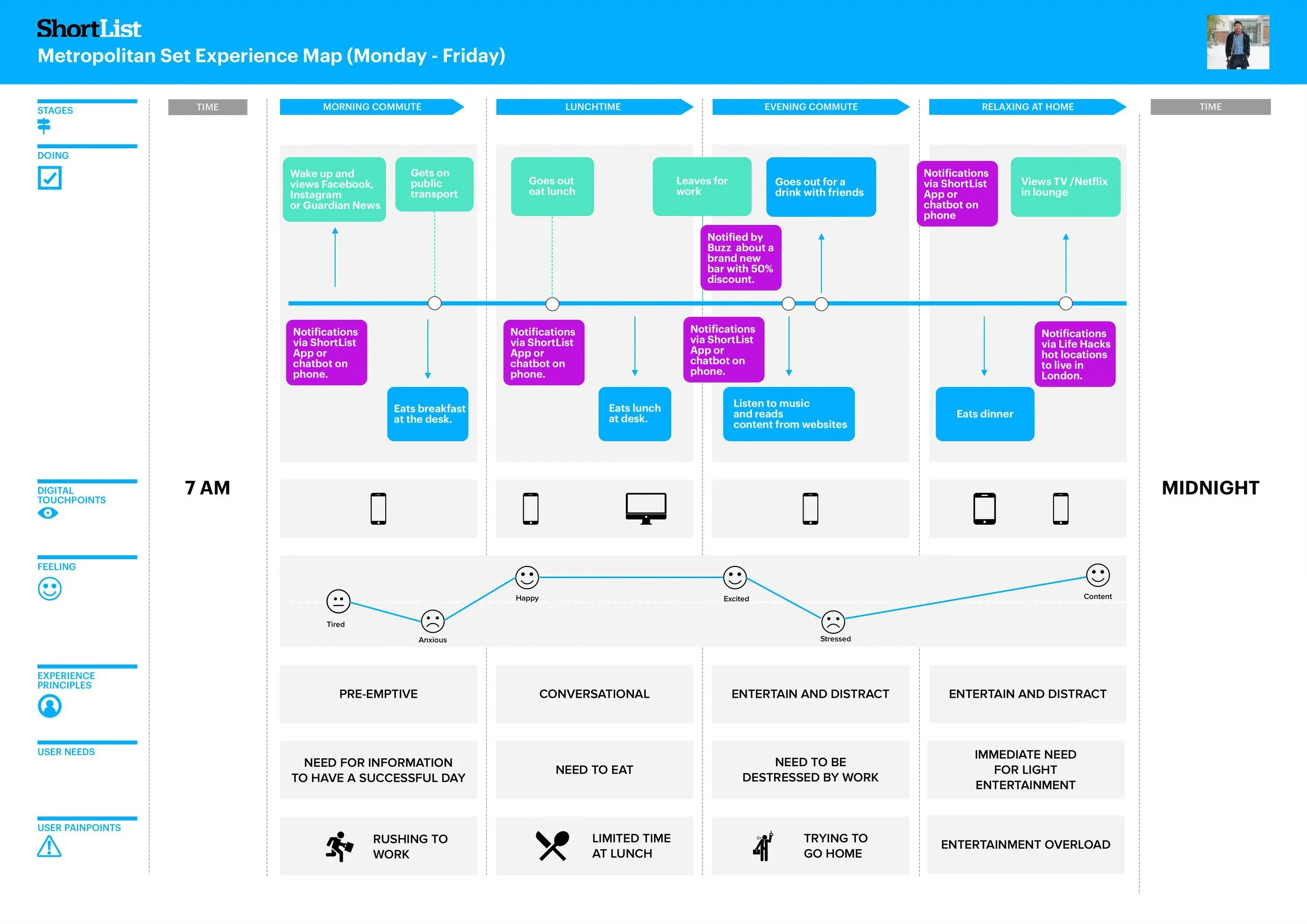
In 2017, there was a noticeable decline in desktop web traffic for shortlist.com. However, 66 % of traffic came from a mobile device. The analytics never lie in these, it was clear that the website need to be redesigned and optimised for the mobile users. I was brought to assist redesign the user experience for shortlist.com and stylist.com.
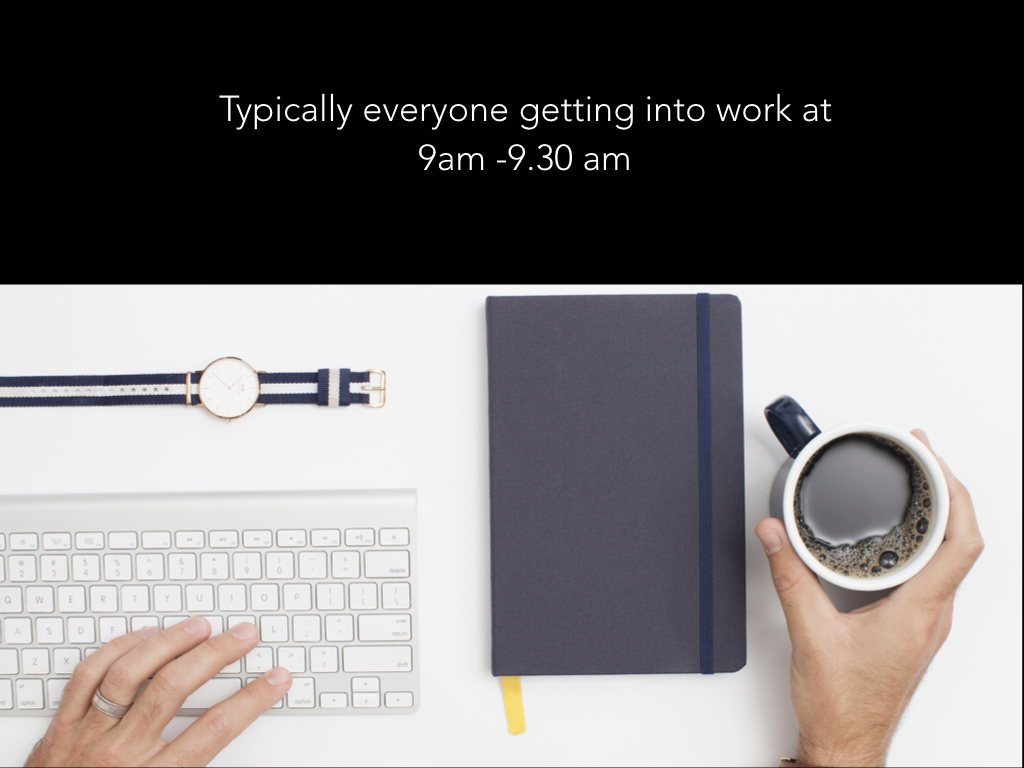
I conducted user interviews with real Shortlist readers. In total I spoke to circa 40 readers of Shortlist magazine and shortlist.com users. In a bid to understand the user’s experience of consuming the website I needed to get under the skin of their day to day routine.
My key objectives for these interviews are as follows.
• Validate our assumptions about users
• Validate and update our outcomes
• Understand how people read online content.
• Ascertain users content preferences
• Uncover any pain points in reading content online
It was important to understand users’ routine, because I wanted Shortlist to design and build solutions to user’s problem rather than just retrofit their existing products to assist users.


Visual design by Vivien Ilett
The secret to improving traffic on a publishing website is to produce amazing and compelling content. The key to getting as many people as possible to see that content is to make it very easy for a user to share this content with their nearest and dearest. So the real UX challenge was to rigorously test how an article could be shared.

Rigorous user tests were performed with real users to see which buttons they would share with friends.

Visual design by Vivien Ilett

Visual design by Vivien Ilett
The user research highlighted the need for ShortList Media to potentially solve the issues of their users. ShortList readers often felt that living in a city felt like they were living in a rigged game. They were time poor and cash poor. As a result I designed some concepts to provide a vision for the products that ShortList Media could produce in the future.
Buzz is a product that that could help users find local bars and events in their proximity. My research unpacked that users often struggled to find cost effective ways to have fun in the city. The buzz could curate the bars and events with the best deals with added incentives for readers to socialise with friends.
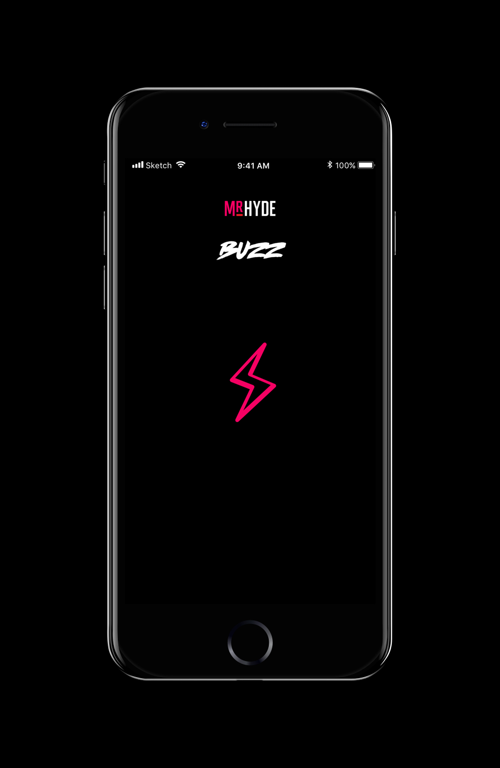
Visual design by Adrian Van Cooten

ShortList users often complained that they couldn’t get on the property ladder or that finding places to rent was an arduous pursuit, perhaps ShortList could help?

Visual design by Adrian Van Cooten


